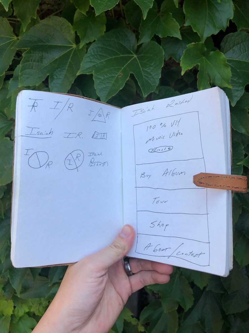
Page 4
Design
Page 4
For context of Notebook posts click here
Design Is Not For Me.
I have a friend who works in the music industry and I wanted to pitch a website idea for one of his artist. They passed on me(rightfully so).
Lets Break This Down To Left And Right Page
Left
I am not a designer as you can see from the horrible designs, lines, and just all around penmanship. I am glad that I had the intuition to at least keep it simple. Looking back if I had to pick it would be the second one.
Right
I am not a designer as you can see from the horrible layout, CTA placement, and flow of the design. In retrospect, I dont mind the layout so much. The layout gets the job done, its simple, and with the right assets it could work.
Developer !== Designer
The point of this is to state you do not have to be a designer to be a developer. I would assume this is the normal. To be a successful developer you should know some common design practices.
This is bad design
This is bad design (unless it is a medieval themed blog
What Should I Learn?
If I had to pick something / first it would be mobile design. The web is moving more and more towards mobile and its a must have now. After that I suggest understanding what looks good and looks modern, from font colors not clashing to hierarchy of font sizes.
Cover Photo - Photo by Me
